CSS、CSS3、SASS实现小箭头、空心小箭头的方法
之前屡次需要用css画小箭头,作为一个职业切图仔,还是记录一下,免得每次都要google复制粘贴不一样的东西,同时要考虑简便性和兼容性
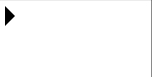
CSS实心箭头-兼容到IE8
这个只用了border,所以兼容性很好
<head>
    <meta charset="utf-8">
    <meta http-equiv="X-UA-Compatible" content="IE=edge">
    <title></title>
    <style>
    #arrow {
        border: 10px solid transparent;
        border-left: 10px solid #000;
        width: 0;
        height: 0;
        position: absolute;
        content: ' ';
    }
    </style>
</head>

<body>
    <div id="arrow" />
</body>
CSS空心箭头-兼容到IE8(附SASS写法)
原理其实是一个空白的箭头盖住实心的箭头_(:зゝ∠)_听着好简单
<head>
    <meta charset="utf-8">
    <meta http-equiv="X-UA-Compatible" content="IE=edge">
    <title></title>
    <link rel="stylesheet" href="">
    <style>
    #arrow {
        border: 10px solid transparent;
        border-left: 10px solid #000;
        width: 0;
        height: 0;
        position: absolute;
        content: ' ';
    }

    #arrow:after {
        border: 9px solid transparent;
        border-left-color: #fff;
        width: 0;
        height: 0;
        position: absolute;
        top: -10px;
        content: ' ';
        left: -11px;
    }
    </style>
</head>

<body>
    <div id="arrow" />
</body>
这样写起来太蠢,用SASS的mixin封装一下就好很多了(此处以⬅箭头为例)
@mixin left-blank-arrow($color,$child-top,$child-left) {
     width: 0;
     height: 0;
     border: 10px solid transparent;
     border-right-color: $color;
     position: absolute;
     &:after{
          position: absolute;
          left: $child-left;
          top: $child-top;
          content: "";
          width: 0;
          height: 0;
          border: 9px solid transparent;
          border-right-color: #fff;
     }
}
@mixin left-arrow($color) {
     width: 0;
     height: 0;
     border: 10px solid transparent;
     border-right-color: $color;
     position: absolute;
     &:after{
          /*清除after样式,避免之前的污染*/
          content: "";
          width: 0;
          height: 0;
          border: 9px solid transparent;
          border-right-color: transparent;
     }
}
实际项目中的效果还是不错的:
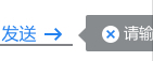
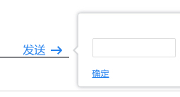
PS : 还可以SASS写一个判断方向方法直接引用
@mixin arrowDirection($direction, $bdc){
     /* 向上小三角 */
     @if $direction == top {
          border-top: 0;
          border-bottom-color: $bdc;
     }
     /* 向下小三角 */
     @else if $direction == bottom {
          border-bottom: 0;
          border-top-color: $bdc;
     }
     /* 向左小三角 */
     @else if $direction == left {
          border-left: 0;
          border-right-color: $bdc;
     }
     /* 向右小三角 */
     @else if $direction == right {
          border-right: 0;
          border-left-color: $bdc;
     }
}
CSS3旋转空心箭头(向上为例)
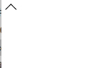
还是要探索一些不一样的方法的,虽然CSS3那就没啥兼容性了,不过简单好懂啊,方法提供在那里,有什么理由不用新的呢
<head>
    <style>
    #arrow {
    	display: block;
    	height: 10px;
    	width: 10px;
        border-width: 1px;
        border-color: transparent;
        border-style: solid;
        border-top-color: #000;
        border-left-color: #000;
		transform: rotate(45deg);
		-ms-transform: rotate(45deg);		/* IE 9 */
		-webkit-transform: rotate(45deg);	/* Safari and Chrome */
		-o-transform: rotate(45deg);		/* Opera */
		-moz-transform: rotate(45deg);		/* Firefox */
    }
    </style>
</head>

<body>
    <div id="arrow" />
</body>
插件用一下autoprefixer或者用SASS封一下就不用写这么多前缀了,懒得写(逃